Top-bottom radar
A practical setup and observation guide for the proprietary Top-bottom radar indicator. This guide covers its chart placement and usage workflow without reconstructing unpublished calculations.
Add and configure
- Open the indicator library, choose Pro in the advanced section and locate Top-bottom radar.
- Click the row to add it to the separate indicator pane. If it is already marked as on the chart, locate the existing instance before adding another.
- Open indicator settings and record the parameters currently exposed. Names, defaults and editability depend on the current version; this guide does not invent unpublished defaults.
- Fix the symbol, timeframe, price adjustments and settings before observing bars. After a change, confirm that the chart has recalculated.
Observe the displayed result
The catalogue places this indicator on the separate indicator pane. Record the displayed labels and settings, then compare closed bars before interpreting a change. Signal and colour meanings require author documentation.
This indicator occupies a separate pane. Align the time positions with price, and do not assume that its vertical-axis values are prices or returns.
For a new colour, label or icon, record the displayed label, time and settings first. Use a meaning only when the author has documented it; red or green alone does not define a buy or sell instruction.
Live chart case: MSTR daily chart and Top-bottom radar
Captured directly from TickAxis with an Ultra account, this MSTR daily chart includes the actual Top-bottom radar curve, fills and icons rendered by the application. Price, moving averages and volume appear above; the indicator occupies the separate pane below.
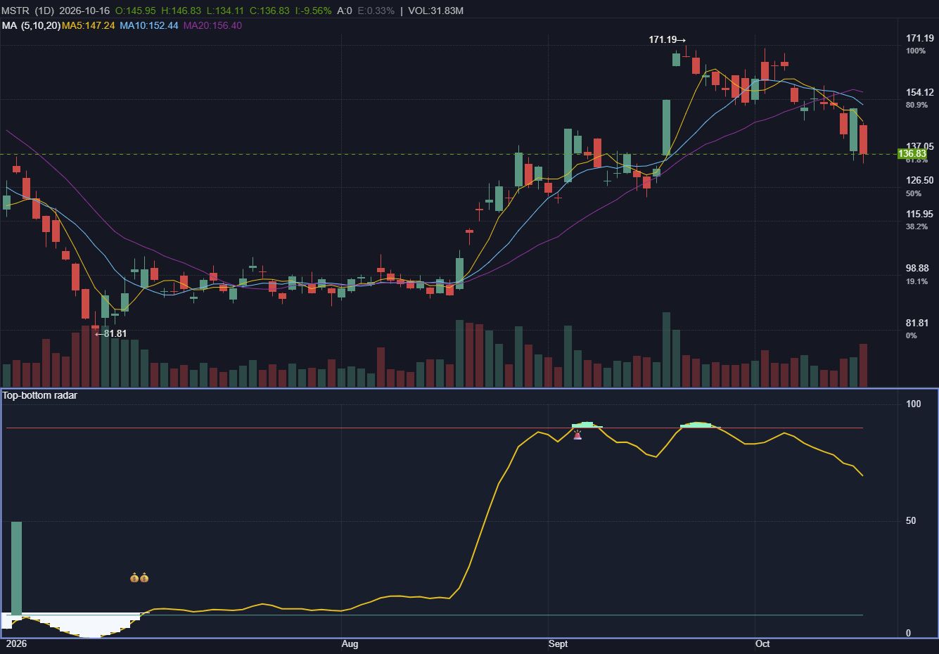
| Region | Visible output | How to compare with price |
|---|---|---|
| Left: lower region | The yellow curve runs near the lower horizontal line, with white fill and icons in places. | Align this region with the price consolidation above. Record where markers occur without treating every icon as an entry. |
| Middle: rising region | The yellow curve rises sharply; pale green fill then appears near the upper red horizontal line. | Compare with the concurrent price rise. Distinguish the ascent from subsequent changes in the upper region. |
| Right: declining region | After the second upper filled area, the yellow curve declines; price also pulls back toward the right edge. | Review the curve direction alongside price and moving averages. One screenshot establishes neither signal lead time nor a win rate. |
The main-chart MA (5, 10, 20) and volume are context, not Top-bottom radar output. The indicator and price use different scales. This case describes visible changes without inventing trading meanings for icons or inferring unpublished calculations.
Known information and usage limits
- The catalogue confirms separate indicator pane placement and Pro classification. Actual account access follows the application’s current entitlement message.
- The calculation is unpublished. This guide does not infer weights, thresholds, signal direction, repainting behaviour or performance.
- A display on an open bar can keep changing. To examine whether historical markers change, save the same historical window at different times and compare it.
- Resolve preview masking, entitlement messages or missing inputs before interpreting the display. A masked or empty region does not mean that the indicator produced no signal.
Questions
What if a parameter meaning is not documented?
Retain the original settings and a screenshot, then confirm with the author. Do not infer the calculation from a name or colour.
Do these steps establish a win rate?
No. This workflow supports chart observation and review; it is not a strategy backtest or an execution record.